Tuesday, May 31, 2011
The blog The Temple of the Seven Golden Camels has a lot of useful and interesting drawing advice, check out this post called Design and Drawing: Simple vs. Complex. I'm working on a complicated drawing right now that has a lot of elements and I'm struggling (in a good way) to balance all the elements while maintaining some kind of visual harmony/organization.
Monday, May 30, 2011
I did this piece of fanart for the talented and all around swellGuy Davis creator of the comic Marquis, about a morally questionable demon hunter in a fictional, upside-down 18th century world. His demon characters are some of my favourite going and the man has some serious inking skills. I had the opportunity to see his work in person last year and it is beautiful.
My favourite character from the Marquis is Hell's Courtesan, probably because she has tentacles for hair. Her complicated tentacle hair made me think of Oiran who were high ranking prostitutes in 18th century Japan. So I took her on a little trip across the globe! Maybe a little presumptuous of me but when the mood strikes..
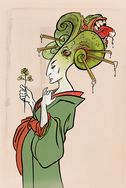
Click here to see the larger version!
My favourite character from the Marquis is Hell's Courtesan, probably because she has tentacles for hair. Her complicated tentacle hair made me think of Oiran who were high ranking prostitutes in 18th century Japan. So I took her on a little trip across the globe! Maybe a little presumptuous of me but when the mood strikes..

Click here to see the larger version!
Thursday, May 26, 2011
Some thoughts on drawing and negative space
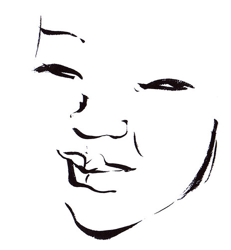
I have always loved mark-making that is concise, when the artist is able to articulate the idea of an object with minimal noodling. To me this type of drawing is like a well-executed magician’s trick, a bit of sleight of hand – from far away the object resolves but up close you can pick apart the two or three well placed lines used to make the trick convincing.
I think the key to simplicity is being able to draw with the negative space, always keeping in mind what each line says about the space around it.
When I was in high school I struggled through some Lao Tzu and although I can't claim to have understood a lot of what he wrote there was one passage that I still think about all the time when I'm drawing because to me it's all about the usefulness of negative space:
Thirty spokes joined at one hub;
emptiness makes the cart useful.
Clay cast into a pot;
the emptiness inside makes it useful.
Doors and windows cut to make a room;
emptiness make the room useful.
Thus being is beneficial
but usefulness comes from the void.
Labels:
chat
Wednesday, May 25, 2011
Sunday, May 22, 2011
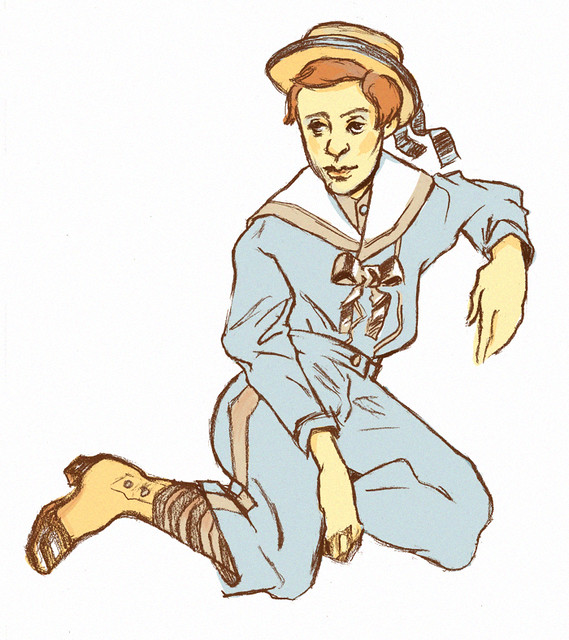
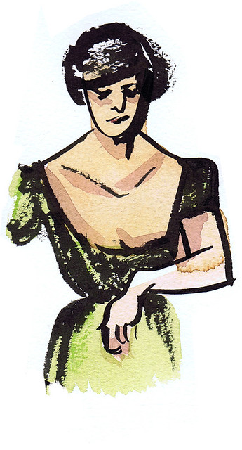
A fun exercise from today: I drew up a pose then I "dressed" the pose up based on a 19th century fashion plate. Inventing drapery is an interesting challenge, we don't think of it when we see it but the way a garment folds around the person wearing it tells you a lot about their underlying anatomy. Even really shapeless clothes hit the body underneath them in revealing ways. I was trying to be careful in this drawing to get a sense of the pose underneath his costume.
Side note: my friend Lena and I are collaborating on a science zine! She's a geneticist, so she is responsible for the science know-how. I have the funnest job which is of course the drawing. Lucky me!
Wednesday, May 18, 2011
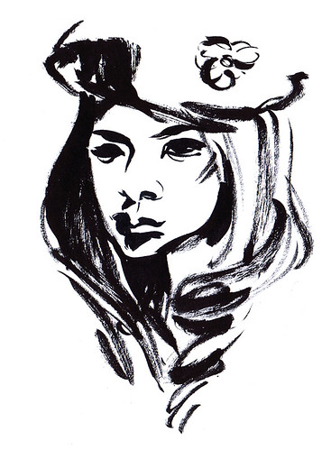
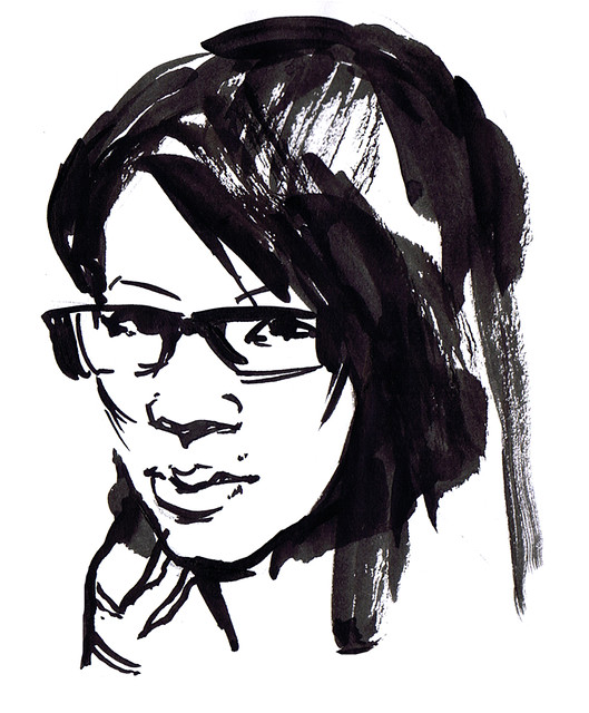
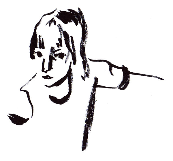
From the sketchbook! Using my new pentel colour brush pen. I don't know why it's called a "colour" brush pen because it only comes in black but it sure is nice. A rougher, drier line than the pentel pocket brush pen. It also splays really nicely, the brush is a little less springy. I think I prefer it. At the very least it is my pen-of-the-moment.
Tuesday, May 17, 2011
Today I read Spent by Joe Matt. The most interesting part of the comic for me was when he was talking about the parts of his previous comics that he'd embellished for the sake of the story (like the ménage à trois with his ex). For some reason I've always taken autobio comics to be sacred - especially the ones that are particularly self loathing (I guess because at that point we really invest in the honesty, I mean if someone is writing about their piss jar one assumes at that point that all the laundrys been aired). But of course a story teller is going to alter and change things for the sake of a better story, it must be next to impossible for them not to! So how much of the rest of Spent is strictly fact?
On a side note, when you look up ménage à trois on Wikipedia you get this picture.
On a side note, when you look up ménage à trois on Wikipedia you get this picture.
Labels:
chat
Monday, May 16, 2011
Here's an awesome post by Jillian Tamaki called Thoughts About Sketchbooks which I revisit when I stare at a blank page in my sketchbook and think WHAT'S WRONG WITH ME.
I went to TCAF last week and had the opportunity to see comic artist Erika Moen who has been an inspiration to me since I was in grade 9 (Weeiird.) And she's still doing it. Plus I got to sit all "behind the booth" with her which totally made me feel special.
I also got to meet Jillian Tamaki in person which was super great! I think I managed to be mostly composed which trust me was difficult. My mantra was something like "pleaseactnormalpleaseactnormalpleaseactnormal". She drew a great picture in my copy of Gilded Lillies.
Labels:
TCAF 2011
Monday, May 9, 2011
...Street art is a gift because it is something that can't quite be explained in terms of conventional motives... maybe that purely creative act is the motive... to give from yourself and not expect anything in return.
- Timothy Taylor, author of The Blue Light Project, on CBC's The Next Chapter.
Really beautiful, really naive? I like the idea but has he seen Exit Through the Giftshop? What about tagging and how it seems to be (from an outsider's perspective) a way of just getting people to see your name over and over again? I feel like his idea of street art is outdated, or at least street art has transformed significantly. Plus I'm not sure if I really believe in the idea of no one having a motive. Not only because I think having a motive is kind of default, but also because we live in such a celebrity culture that the need to tap into "the fame monster" is second nature.
I think I have to read this book!
Tuesday, May 3, 2011
Sunday, May 1, 2011
Subscribe to:
Comments (Atom)
